Wednesday, May 14, 2014

Fun With Color Studies

color study for horse painting

Color studies are fun to do. For one thing, you don’t have to worry about putting in details unless you’re doing them to get the detail right, like a person’s face or a dog’s eye. For another, you don’t have to get the shapes and proportions exactly right, either. And, they’re usually quick to do, so if one doesn’t turn out the way you planned, you can easily do another. 

What is a color study you may wonder? 

A color study is a small (usually) quick painting done to work out possible problems in a larger, more finished painting. 

Why do a color study?

1. To work out color harmonies
2. To work out values
3. To practice painting a subject or object or the whole painting
4. To prevent having to make a lot of corrections to the final painting

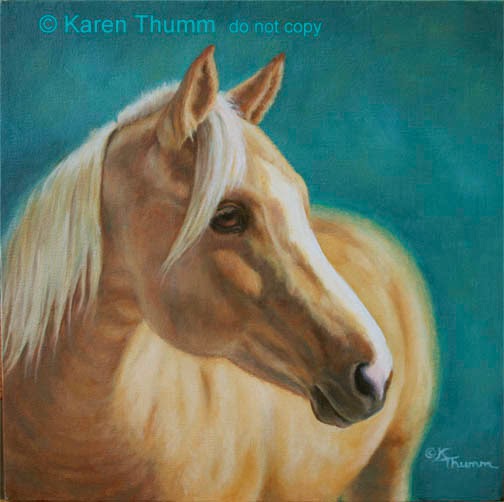
Before beginning the big version of “Twilight Reverie”, I decided to do a color study. Why? Because color harmonies, accurate color for the time of day and the atmosphere of the painting will be critical elements for what I want to say with this painting. Plus I wanted to get an accurate and pleasing color for the horse figured out before putting a lot of paint on a big canvas and then having to do parts over again. 

So, I spent a happy afternoon yesterday painting away on this 8x10 inch color study, drawing right on the canvas and slapping on the paint with little regard for detail. Detail in this instance is not necessary to get a feel for how the colors will work together. Nor are absolutely accurate horse proportions. 

Same colors look different on white background from the yellow  toned canvas

First I played with paint, trying various combinations of colors to get the horse color I’m after. I tested the color mixes on a sheet of white canvas paper and came up with some mixes that for the horse that match closely with the reference photo and my own familiarity with my horse’s color. Then I found a small canvas board that was already toned with a light yellow and proceeded to create the color study by drawing directly on the board. 

When it was finished, I confess to being pretty pleased with the result. But, most important of all it revealed that the color mixes used will be much warmer and bright when painted on top of the yellow toned canvas. I had expected this to some extent, but the change was more dramatic than anticipated. 
Desaturated colors in Photoshop

Now I must ponder, will that effect diminish with thicker applications of paint? Do I need to soften, dull down or lighten the color mixes to achieve the soft evening reverie mood that I’m seeking? 

I’m also debating whether or not to work some grass into the hilltop that the horse is standing on or leave it all sand. And, adding some road behind the fenceline will also help to break up that large area of solid green trees. Some experimenting in Photoshop is in order before beginning the big canvas. 

Stay tuned. 
Here is the cropped version that will actually be the painting

Friday, May 9, 2014

Facing A New Challenge

"Sweetie" 11x14 inch pastel painting of a horse


The past few days I’ve been solving an income tax problem and loading up my laptop computer so that I can use it in the studio. I’ve also been making some revisions and changes to my webiste, a much overdue task. That means no painting has gotten done. However, that’s about to change. 

Many people or “peeps” as we refer to them on Facebook, post old pictures of themselves or family or old artwork on Thursdays for Throwback Thursday. It’s a kind of a fun thing, bringing back our own memories and giving a few laughs at hairdos, clothes and so forth. 

Here is my contribution to this week’s Throwback Thursday. This is an 11x14 inch pastel painting of a Quarter Horse mare that I did for a former client several years ago. It’s one of my very best horse pastels that I’m still proud of. 

In reviewing images old and new for the website, I’ve recently come to the conclusion that I got a lot better working with pastels than I currently am with oils. That is a sobering and almost a discouraging thought. So, how do I get better at the oils? By doing lots more of them, of course! For many years I did nothing but pastel portraits of horses and dogs and a few cats. They HAD to be good and HAD to be a good likeness, so I put a lot of effort into them, learning to handle the medium well to get the effects I wanted. It was excellent training even though I finally burned out on the whole portrait process. 

This new realization has somehow energized me to get back to work on the oils that remain to be finished and the new ones waiting to be done. “Glory” was a start, and I’m happy with her for the most part. Just as getting a juried show rejection makes me more determined to improve my art, so does knowing that my pastels are better than my oils. 

That shall not stand. I’m up for the challenge and eager to get started!

Sunday, May 4, 2014

Palomino Painting; Glory is Finished!

"Tribute To Glory", 12x12 oil painting on canvas


A few days ago I finished the Glory painting.

Not only was it great to finish this painting which has been “under construction” for so long, but it was a very pleasant day spent in the studio. With the window open for ventilation, I listened to the Loons calling on the lake all afternoon as I zoned out on the painting.

The painting is signed and awaits some drying time before I varnish it. It will really glow when varnished. Then it will be for sale. 

I think it will make a great print, too. Don’t you?

Friday, April 25, 2014

Palomino Painting; Glory's New Background


Today Glory got a new background and some refinements. 

I’m not yet sure if maybe the background isn’t a little too dark. I’ll let it sit for a few days and then decide whether to leave it or repaint it. The eye also got some “refinement” that didn’t turn out as expected so I’ll be working on it again. 

Next up is painting the mane and forelock and then she will be pretty much done. 

This is a better, more true photo than the last one even though the background is a bit more green. 

Your comments on the background would be welcome. 

Thursday, April 24, 2014

"Twilight Reverie" Horse Painting - Part 2

oil painting on canvas, outlines painted


Another quick blog post for today. 

Yesterday, I finally put the first paint to canvas on the horse painting, “Twilight Reverie”, after tweaking the drawing some more. Fearing that the pencil lines would be obliterated by the solvent in the paints, I painted over all the lines on the canvas. Choosing a thinned down color that is close to that of the horse, I started out using a small round brush but quickly switched to a tiny flat. Either I just haven’t gotten the hang of using rounds or I don’t have any with good points. 

At any rate, the painted lines now give a hint of where I’m going with this painting and completely change the look of the canvas. After letting the paint dry thoroughly for a few days, I’ll lay in the first layer of color. Since time is short for getting this painting done, I’m choosing to bypass my usual grisaille underpainting and go directly to color. That shouldn’t be a problem if I stay alert and observant. 

Wednesday, April 23, 2014

Palomino Painting; Glory's New Eye

"Tribute To Glory" oil painting on canvas


It’s been a little while since I last worked on Glory. In fact, it’s been so long since I started it that it almost qualifies as an Oldie But Goody - except for the not-being-finished part. 

The last time I worked on Glory back in February, I created a new, larger eye and painted the eyeball a plain gold color. It’s been more than a little unsettling to look at her like that, like some undead creature, so today when I finished working on the big Twilight painting and didn’t want to stop, I decided to give Glory a proper eye. 

This is the result. When the paint is dry, I’ll give her some eye lashes. She looks much better with a larger eye. Here’s the old eye version. 
First eye unfinished

I plan to work on Glory again tomorrow and hope to get her pretty close to being done. All that remains is to repaint the background, repaint the mane and forelock and do some touchups. 

It feels mighty good to be painting again. Thank goodness I can still sit at the easel even with the broken leg. Dropping things is a problem, though, and sometimes I have to wait for my husband to get home to retrieve them for me. Molly Kitty is no good at all at Fetch. 

Thursday, April 17, 2014

New Painting; "Twilight Reverie" - Part 1


Reference photo for oil painting, "Twilight Reverie"
Beginning a new painting is always an exciting time. The new work is full of promise and anticipation, and that is what I’m feeling as I begin this new large painting. In this case, it’s taken over a year of rumination in my mind since first being Wowed by the reference photo. The catalyst to finally get started was the possibility of a museum show later this year. They want large paintings, and I have none to submit.

IDEA FIRST OR PHOTO FIRST?

For us realist artists, there are two ways to begin a new work of art: get the idea first and then look for photo references to help create it, or find a photo that inspires you and create a composition based on it. There is a third, of course, which is to get the idea and create the art using no references at all but the artist’s imagination and knowledge of the subject. The third option is not yet within my scope for large works of art; sketches yes, but not major paintings or drawings.

PHOTO FIRST - THE INSPIRATION

In this case, as soon as I saw the photograph, it really grabbed me emotionally and artistically. It was late September of 2012, my horse was very ill, and I had just turned him out after medicating him. He stood on the hill behind the barn in the early morning light, looking for his herd mates. The backlight on his form was beautiful, and the expression on his face was that of wondering uncertainty. Given his age (he was 27 then) and his health, it seemed the perfect image to convey his circumstance while at the same time portraying a universal theme of facing the unknown.
composition thumbnails for painting

GETTING STARTED

Over the months I considered many options for creating this painting. First was what background to use: the one in the photo or some other pasture scene from my references? Coming a close second was whether the format would be horizontal or vertical. The longer I mulled over the choices, the more my artistic gut told me to stick with the photograph background and use a vertical format. Right from the start, I wanted this to be a rather large (for me) painting and for the horse to dominate the canvas. When it came down to the feeling I wanted to convey, the dark background was the best option for letting the horse stand out in the dramatic light of a waning day. I had already decided to change morning light to evening light to fit the theme better.

THE ELEMENTS

The next choices were to decide what elements in the background to keep, what to eliminate or change and what needed to be added. Again, my artistic gut was telling me that the diagonal of the fence and light worked well in the composition. The horse standing on a hill overseeing his world and facing an uncertain future was also crucial to the story.
value study for painting

THE VALUE OF A VALUE SKETCH

Usually my colors are on the bright side, but with this painting I want to use a limited palette of colors and keep them somewhat subdued and harmonious. The values will also be crucial to the success of the painting, so I spent an hour doing a small value sketch once the format for the painting was decided. I’m glad I did because it showed me that the dark mass of the trees and shaded area needed to be darker than I anticipated if I wanted the horse to stand out.

CHOOSING A CANVAS SIZE

Finally I was ready to prepare a canvas for the painting, but what size to choose? Using two pieces of L shaped matboard, I played with various cropping options on the reference photo until I found one that worked. Next, I searched among my canvases on hand and found one that was close to the needed dimensions.

THE MARVELOUS PROPORTION WHEEL

In order to determine canvas size, I used a proportion wheel which is a tool I was introduced to in art school and would never be without again. It allows you to figure out dimensions to either up or down size an image using either the larger or smaller size dimensions as a base. It will also tell you by what percentage to enlarge or reduce an image. In my case, I found, using the proportion wheel, that the only canvas on hand that would work was a 24x20 incher. By adjusting the cropping of the photograph a little, I was also able to reach a percentage of 200% to enlarge the image for the canvas. That would make creating a grid so much easier; one inch squares on the drawing would be 2 inch squares on the canvas. That meant no dealing with fractions of inches to drive me crazy.

TONING THE CANVAS

Having selected the canvas, I toned it all over with a warm but soft yellow that will help to unify the image. Then it was set aside to dry.


drawing with grid over it

DRAWING AND GRIDDING

In order to get the image onto canvas, I used a two step process. First, I traced the photograph onto a piece of acetate with a technical drawing pen. Yes, I traced the photograph because time is short to get this painting done. Then I scanned that into the computer and enlarged the image and printed it out on a sheet of 13x19 paper, using the proportion wheel to determine the dimensions of this enlargement to allow for the 200% enlargement for canvas. Taping that to a piece of scrap matboard, I then taped another piece of acetate over the drawing and drew a grid over it in one inch squares using one of my big right triangles to be sure that all was squared up.

Having accomplished that, I next turned to the dry canvas and drew a grid of two inch squares onto it. The tricky thing I learned was that although the canvas is a “24x20” incher, it’s actual dimensions are about a quarter inch less than that in each dimension. So, figuring out which two sides were the most critical to the composition, I drew an X in that corner of the canvas and made all my measurements in each direction from there.
drawing on canvas with grid

DRAWING ONTO CANVAS

Getting the image onto canvas is probably the most critical step in the process, and this is where I took a lot of time. Using the two grids, I first drew the outline of the horse onto canvas and then proceeded to refine it. Any tracing or drawing is going to have slight inaccuracies when enlarged, and this is where it is absolutely critical that an artist’s skills of observation and knowledge of the subject be very keen. I spent the most time refining the head since it is very important to the painting.

I don’t care what the “Tracing is cheating” art snobs say. If you don’t have those skills of really seeing and knowing your subject you won’t have a successful image from a tracing. It’s just a tool and a shortcut when time is critical.


grid erased
Okay, now with the image on canvas, I erased all the grid lines, leaving the drawing by itself. I still have a little bit of tweaking to do on the drawing, but it is ready for the next step; painting!