Showing posts with label Karen Baker Thumm. Show all posts

Sunday, August 7, 2016

Stepping Stone #1; "Morgana", a Morgan Horse Drawing


"Morgana", graphite pencil drawing, Morgan mare

After several more hours and many revisions to the drawing, "Morgana", I am declaring it finished. It is the first piece of art (other than sketches) that I've completed in over two years, so its significance can't be under estimated. 

"Morgana" will be my first finished piece of art in the Stepping Stone series; a series of paintings and drawings that will help me to become actively creative again after a creative block of several years. Not only was it a confidence boosting drawing but also a learning experience. Here is some of what I learned:

1. Choose the paper support wisely before beginning to draw. I fought this utilitarian drawing paper from the beginning. It has very little "tooth"to grab onto the graphite and proved very difficult to get the darks as dark as I wanted them. 

2. Measure twice; draw once. I began the drawing sitting on the couch watching TV, holding the sketchbook on my lap while holding the reference photo in my left hand. I eye balled the proportions and angles rather than measuring them, and they were off in several places. I didn't discover this until the drawing was finished. 

3. Don't proceed with the drawing/painting until you're sure that the initial outline drawing is absolutely accurate. After that, corrections are very difficult if not impossible. 

4. Size matters. If this is to be something more than a quick sketch, draw it larger or enlarge the outline drawing on a copy machine or computer.

5. If your reference is a small 4x6 inch photo, scan it at a high resolution and enlarge it on the computer. Either work from a computer screen or print out the enlarged photo.

reference photo for the drawing, "Morgana"
This latter point was the most telling lesson of all. I didn't scan the photo until the drawing was done and did so only to show you what the reference was like. When I opened the image on the computer screen and saw it enlarged by zooming in, I could see far more detail than I had been able to see in that small 4x6 inch photo print. It was a real Ahah! moment to realize how much detail I had missed putting into the drawing. 

But, that's okay. Lessons learned, and that is the whole purpose of the Stepping Stone series; to build confidence and build skills through DOING. At the same time, I'm scraping off some of the rust of the inactive years and awakening again skills and lessons learned in the past. 

What will I tackle for Stepping Stone #2? Check back to find out. 

Thank you, as always, for your interest and support.

Thursday, July 28, 2016

New Drawing; "Morgana"

 
"Morgana" pencil drawing of a Morgan Mare


While watching the Democratic National Convention this week, I've been working on this drawing in one of my sketch books. 

As reference, I'm using a photograph taken several years ago at a Morgan horse farm. Her name was Lady, and she was a broodmare. In fact, she is the mother of Bullet, the Morgan colt that I've painted twice. The reference photo shows her with mouth open eating hay; a not very flattering picture. The challenge was to change the mouth, and I'm quite pleased with how well that turned out.

The drawing needs a lot more work. I will keep working on it to get it as close to the photograph and artistically pleasing as I can, keeping in mind balancing the values. It will be excellent practice in building up my "seeing" muscles again after such a long layoff. 

So, here you have "Morgana". The drawing is not big; about 6x6 inches done in graphite mostly with a 6B pencil and a little with an Ebony pencil to get the darks more dark. It has a ways to go. Already I can see about ten things that need to be corrected. It will be posted again when it's finished. 

I've always loved to draw  and used to do it endlessly as a kid. I'm really enjoying getting back to my drawing roots again and will be doing more of it from now on as part of my Stepping Stones project of rehabilitation and building up confidence in my artistic abilities again. 

 Please let me know what you think of this new drawing (remember, it's not finished yet).

Thank you for stopping by.

Wednesday, May 18, 2016

Closing a Door and Opening Another?


"Feel So Fine" springtime foal is now home and available for purchase.
For several years I've had my artwork in a very nice shop in the nearby small village of Central Lake. It started out as mainly a consignment shop for local artists and craftsmen, but over the years the shop has transitioned into more and more stocking commercially made very tasteful home decor and clothing.

I had good sales in this shop for quite a few years, but in the past 2-3 sales fell off considerably to almost nothing.

This past week the owner of the shop called to ask if I wanted to come get my artwork, and I readily agreed. It was something I had been intending to do for months but hadn't gotten around to. With sales so low and the shop no longer emphasizing local artists and craftsmen, it didn't make much sense to leave the art languishing in the recesses of a side room where many visitors didn't go.

Yesterday I picked up the original art, prints and the few note cards that were left. No one had told the young clerk, who was alone in the shop, that I might be coming in or where to find my art. It took her a long time to find it in their back room, and not all of it could be found in the whole shop! I had kept very careful records of what was in the shop and what had sold over the years so arrived with my own inventory list of what SHOULD have been there. 

If I had any regrets about leaving the shop they were quickly dispelled. Remembering that although the owner, an animal lover, had always expressed great admiration for my art, the woman she later hired to order the merchandise and approve the art and do the displays did not seem to share her enthusiasm. More than once I found original paintings of mine hidden behind lamps, and when I stopped in last year, I no longer had my own designated print rack; in fact my prints were nowhere out to be seen. Is it any wonder that none were selling? This was a big hint that it was time to go.

At this point my feelings are very mixed but mainly positive about this "loss" of gallery representation. Merry was very good to me over the years, and sales were good when I had given up other marketing outlets like art fairs and horse expos. In some years, the shop was my only source of income. 

Now that the art is home, some pieces will be available to show to honest to goodness local galleries where actual art buyers will be looking for their next purchase. That will be a better fit for me at this point, and that is my near term goal. 

That is the door I hope to open.

Saturday, February 6, 2016

One Step Forward, Two steps Back


It's safe to say that I am rusty when it comes to painting. Witness the painting above. 

Last week I put in time on this painting two days in a row. On the second day, I wiped off part of what I had painted the day before. On the third day, I tried to wipe off what I'd done on Day Two, but the paint had already dried, and I was only able to get off a little bit of it. 

The "progress" you see is on the hind legs and haunches of the horse. The left side isn't too bad, but the right haunch is a different matter. I mixed three piles of reddish brown: dark, medium and a lighter version. But somehow the haunch all came out pretty much one value. 

How did that happen? I asked myself. Well, I just wasn't paying enough attention when I mixed fresh batches of each value. I will have to paint that area again. There are other corrections to make as well. 

Although I'm eager to get back to the painting, I've taken a break to give the paint plenty of time to dry before I put on another coat and also to get some progress made on income tax information for the accountant. Then I plan to set aside three whole days to do nothing but paint the horse. 

So that's where I am now; dealing with Life responsibilities before getting back to the painting. Next time you can be sure that I will mix those different values more carefully and test them out before putting paint on the canvas again. 

Sometimes it's just one step forward and two steps back. That's just the way it goes in the life of a painter.

Sunday, September 13, 2015

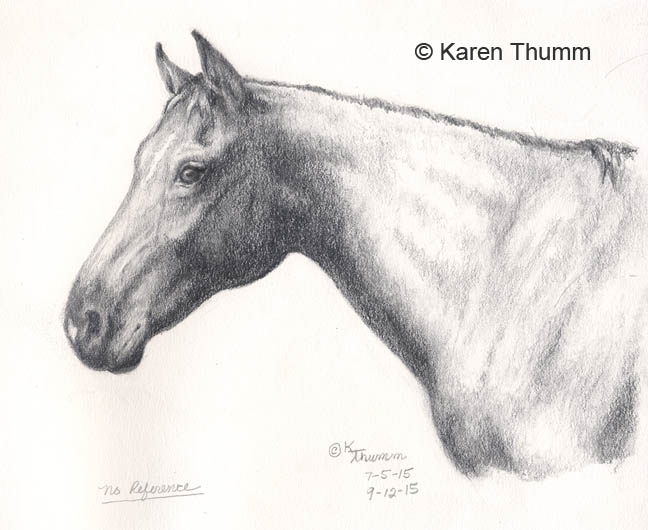
"Impromptu" Revisited - A Horse Head Drawing

"Impromptu" a horse head pencil drawing

Saturday, September 12, 2015 was an exciting day for us die hard Michigan fans. The University of Michigan has a new football coach, as almost everyone in the country knows, and yesterday was Coach Harbaugh's debut in the Big House where he once played on that same field years ago. 

As a native of Ann Arbor, child of a professor and University graduate, my roots with Michigan football run deep. Many is the time, from a youngster through college and into adulthood, that I cheered on the Wolverines and sang Hail To The Victors within the awe inspiring walls of the Big House on crisp Fall afternoons. The stadium truly lives up to its name. 

On this particular Saturday I chose to revise this little drawing while watching the game. It was done back in July, if you remember. It had been an exercise in drawing a horse head using no reference whatsoever except my own knowledge of and experience with horses. But, I wasn't completely satisfied with the results, so on this day I gathered pencils and erasers and set to work tweaking here and changing there as I cheered on the Wolverines. 

Unfortunately, the paper support only allowed minor tweaks and very little erasing. For that reason, the drawing is now as good as it's going to get. It's better but there are still changes I'd like to make while keeping to the exercise of using no reference. Perhaps I'll throw a sheet of tracing paper over it and rework the outline and create a completely new drawing from that. Perhaps in colored pencils this time which is a medium I haven't used in many years now. 

Meanwhile, Coach Harbaugh got his first victory in The Big House, and the great tradition of Michigan football has been revived. 

GO BLUE!

Thursday, October 16, 2014

Old Horse Painting and Getting Back To Normal

"Bear", 11x14 pastel horse painting

It's been a long time since I last posted, and although I haven't quite gotten back to the easel yet, I thought I'd share this old portrait with you today for Throwback Thursday.

This is Bear. He was an Appaloosa gelding who belonged to a riding friend several years ago. I had the pleasure of painting his  portrait as a gift and am still reasonably happy with it. An artist is never completely satisfied with any finished painting, but that's another story.

The portrait was done in pastel, and what a fun time I had getting all that roaning to look natural and to match the markings on Bear's face and body. I haven't worked in pastel in a very long time now, not since I quit accepting portrait commissions, but I'm getting the urge to pick them up again.

That will be a lot easier now that my studio is finally all put back together after the long layup during the surgery recovery. During this past month, I sorted through all of my oil paints and separated them into warm and cool colors. Then I separated out duplicates and packed them in an old fishing tackle box that I'll use for painting outdoors.

The final step in getting the studio back together involved going through my art supply closet and rearranging it. In the process I found a few things that I'd forgotten I had and got rid of some other things no longer needed. All is arranged much better now, and my lifetime supply of old t shirts and pillowcases is organized in two boxes to be used as paint rags as needed. There was even left over space to put a few things away that had been kicking around the studio floor.

And, very lastly, my husband brought my drawing table back out of the attic to resume its old position folded up against the wall. I love that drawing table; so compact when it's folded and yet a large working surface when set up. It was the final piece to putting the studio back into full operating mode.

Meanwhile during the month, I went to physical therapy twice per week, did my exercises (mostly) faithfully and got caught up on various doctor appointments and the cat's vet appointments. I am now finished with PT and am looking forward to more free time to devote to catching up on so very many tasks that have gone undone for way too long. There are bird feeders to clean and set up and horse blankets to wash for the coming winter among many other tasks.

Homeward Bound on a trail ride
During the month of September, I was able to ride somewhat regularly and to fit in four trail rides. Oh, how glorious that was! Trail riding season is fast coming to an end, and it's time to plan for arena riding through the winter.

Speaking of which, can you believe that the Holidays are almost upon us?! Where has this year gone? It certainly has flown by.

Tuesday, July 29, 2014

Horse Painting; Glory From Start To Finish


My usual studio setup for painting, with references nearby. 
Whenever I create a painting or drawing, I take progress pictures along the way. By the finish, I’ve got lots of photos that I don’t need. Some are blurry, some are crooked and some have bad color. I’m starting to weed them out as the art progresses now, but I have a lot of old art photos that need to be purged. 

Today I did a purge of the Tribute to Glory pictures, and it occured to me that you might like to see how the painting progressed from start to finish all in one post although most of these have been shown before. So, here goes! 


The first step was to tone the canvas with a nice palominoey yellow. Then I drew the horse directly on the canvas using my reference photo as a guide. I added white to the mane and blaze in order to define them from the beginning. 


Next I did a value painting in gray to establish the lights and darks. I liked this stage so much that I thought about leaving it as is. This is a technique often used by the Old Masters. 


The next step was to add a thin layer of color over the whole painting. 


Following that I laid on a second layer of color, a little heavier this time. You can still see the gray underpainting showing through. 


At this point I realized that the proportions of the muzzle were too narrow and Glory’s dished face did not show as well as I wanted. I made a number of corrections to the face and muzzle and jaw line and also thinned the hindquarters  to keep them from dominating too much by painting over them with the background color. 

The colors change from photo to photo due to different lighting conditions. 


In this next photo I’ve begun applying a third layer of color and have gotten as far as the throatlatch. You can see a definite line between the layers. 


In this photo I’ve finished the third layer of color and have added some highlights to Glory’s coat. She is almost done!


At this point I decided that Glory needed a larger eye and painted one. I have also made other corrections along the way at each stage; ones that aren’t as visible but affect the whole. 


And finally the painting is done! Glory got some eye lashes, the mane and forelock were finished and a final layer of color went on the background. Notice that I softened the line of the hindquarters  by blending some background color over it in order to push it further back in the picture plane. 


Here is my reference photograph. This is a small 4x5 film print that is not the best image but somewhat captures Glory. I took some liberties in my painting to portray her more as I remember her and gave her a deeper gold coat than she had in reality. The final result is a painting both of tribute to Glory and one that I hope will be a popular image. 

Who doesn’t love a palomino?


Saturday, July 5, 2014

Little Pinto Oil Painting

Oil Painting of a pinto foal

Yesterday's leftover paint painting didn't go as well as the first one I did. But, Hey! I made the effort, and that's what counts.

The little pitcher painting didn't get many Likes on Facebook so apparently others didn't think it was as wonderful
as I do. But, that's okay because "I" know it represents a step forward and turned out well for what I can create at the current time.

After painting a color chart of my brown oil paints, I used the leftover paint to create this little 5x7 of one of my Breyer foals. I didn't pay enough attention to proportions or fitting the image on the canvas (it was close to dinner time), so the foal turned out looking more like a pinto pony. I was rushing and having some trouble with the paint so just gave up at a certain point.

The background consists of raw ochre (a color I very much like) and burnt sienna over that. The foal is painted with burnt umber, I think, and some Van Dyke brown that is almost a black. And white, of course. Again, I used the #6 and #12 mongoose brushes.

I have one more color chart to do, but I've run out of space on the wall to put wet paintings so will put that off for at least a few days. Meanwhile, I'll get back to working on the big Twilight painting.

This weekend my "kids" are home, and we're celebrating Independence Day. I tried helping out in the kitchen last night but ended up very tired and very sore, so apparently I overdid. I will do quiet activities for the rest of the weekend and wait for the okay from the surgeon to get back to normal activities.

Saturday, June 21, 2014

Hummingbird Syndrome and a New Horse Sketch

"Goldilocks" palomino filly sketch


I’ve been suffering lately with a case of Hummingbird Syndrome; easily distracted and flitting from one project to another without finishing any of them. 

PAINT PIGMENT PROJECT

Having put the paintings aside to ponder on them, I decided to inventory my oil paint pigments to figure out which ones were getting low and needed to be ordered. That done, I decided to research each of those pigments and make notes on them as an educational project to help make better choices when choosing which colors to use. This turned into more of a project than initially anticipated! Some of my tubes of paint are so old that they don’t contain any information on them as to the pigments used or their toxicity and lightfastness; all information that is included on more recent tubes of paint. 

What followed was research online at the websites of various paint manufacturers and other art related sites. To my dismay, Grumbacher does not include pigment information on their website while Winsor-Newton, Daler Rowney and Old Holland do. Of course, I have a lot of very old tubes of Grumbacher oils. To supplement what I couldn’t find, I consulted the Artist’s Bible; Ralph Mayer’s Manual of Artists Materials and Techniques. Pretty dry stuff that and also incomplete for some pigment numbers found on newer tubes of paint. The book was last revised in 1991 so is now out of date. 

I’ve almost finished this project, and it’s been very illuminating. For instance, a company may change the pigment or pigments used in a particular named color over time. And what one company calls Burnt Sienna may contain totally different pigments from what another company calls Burnt Sienna. Each pigment has different qualities of lightfastness, opacity, drying time and toxicity, so it pays to know what’s in the tube. It’s also a good reason to stick with one or two brands of oil paint. 

FOAL SKETCH PROJECT

One evening while watching TV, I sketched the above drawing of a foal. The next morning I worked on it some more and added some background. It turned out so well that I had to share it. Then I thought about doing more sketches, something I should be doing daily anyway. So I got out some more photographs to copy. 

HORSE PEDIGREE PROJECT


My horse, Scottie as a four year old
But, before I could do anything about that, I was distracted again by a photograph of my horse as a four year old just before I bought him. Having scanned that and a few other photos and the sketch, I posted it on Facebook to share for Throwback Thursday when people post old photos of themselves or family or childhood pets; that sort of thing. 

Before I knew it, I started researching my horse’s pedigree and found some resources online. The biggest find online was a website where you can type in the name of a horse and get that horse’s pedigree that may go back hundreds of years. For instance, my horse is an unregisterd Quarter Horse, but his sire is registered. In researching his sire’s pedigree, I was able to track back as far as the foundation sires of not only the Quarter Horse breed but the thoroughbreds whose blood are part of the breed through a Thoroughbred named Three Bars. Three Bars goes back to the Godolpin Arabian, Darley Arabian and Byerly Turk all of which were used to improve the Thoroughbred breed back in the 18th century. Their pedigrees in turn go back to the 1600’s. That’s where I stopped. 

Finding these three horses in my horse’s geneology was nothing short of magical. It took me back to my childhood of reading Marguerite Henry’s books, Album of Horses and King Of The WInd. I adored Album of Horses and spent many hours reading and rereading it and even copying some of the drawings and paintings. 

A SPOOF ATTACK!

Meanwhile I dealt with a spoofing attack on my email account. Some spammer was using my email address to send out hundreds of thousands if no millions of spam emails. Although the spam wasn’t going out of my email server, all the returned spam emails were coming into my email server. By the thousands! The highest count was over 9000! A call to my website host was not of much help except the advice to just wait it out and the returned mail notices would go away as the spammers moved on to use someone else’s email address as the From address. This blitzkrieg lasted for five days, and thankfully, yesterday morning it ended. Abruptly. 

The website tech guy advised me to sign up for a newer hosting package that included more perks and better spam filtering at a lower cost. So, of course, I had to look into that but couldn’t find much on the website. 

CATCHUP DAY

With all of these loose ends dangling at this point, I’ve dedicated today as a catchup day. Putting aside horse geneology and website hosting changes, I will endeavor to finish the pigments research project. Going through my horse’s folder and throwing out old farrier receipts, vet visit bills and Coggins test results is also on the schedule after which I will file it away again. And make a separate folder for the geneology finds. 

But first the bathroom needs to be cleaned. 

Thursday, June 5, 2014

Twilight Horse Painting; Two Steps Forward and One Step Back

Horse oil painting on canvas


That’s how it goes sometimes with painting. Almost every painting is a struggle at some point. 

The background on the Twilight painting is now pretty much done - unless I decide to change something. Painting that foreground grass was one of those two steps forward and one step back sort of things. 

Painting blades of grass is like, well, watching grass grow. I had half of the grass painted and had to wipe it out and try again. Thankfully, with a little more planning, that grassy hilltop came together at last. 

Now all that remains is to finish painting the horse with the final layers. Two steps forward and one step back? I hope not!

Thursday, May 22, 2014

Prancing Foal Pastel Painting

"Feel So Fine" Pastel horse foal painting
It's Throwback Thursday on Facebook, so I thought I'd share this older pastel painting of a lively colt which is still available for sale. 

Bullet was a five week old Morgan colt just turned out with his mother on a late Spring morning. His youthful exuberance is expressed in this painting as he prances about in the lush Spring landscape. 

The painting is 12.5x14 inches and is available framed for the special price of $225. Please contact me if you're interested in putting this speedy Bullet on your living room wall. 

You may email me at karen@equineartist.com

Monday, May 19, 2014

High Spirits and Horse Art

"High Spirits" pencil sketch of a rearing horse

High Spirits. 

That’s what I’m feeling these days as I get back into the swing of creating and painting regularly after a long hiatus. 

I found this little freehand drawing while going through some records this morning and thought he fit my mood exactly. 

There has been more progress on the Twilight painting. Yesterday I finished laying in the first layer of color on the background. The painting has been put up on the wall to dry after which the first color will go on the horse. It’s a big painting, and it’s pretty imposing on the studio wall. 

Today I will start the process of getting the other new painting drawn on the canvas. This is another big painting of the same dimensions, except that it will be a horizontal format. 

"Twilight Reverie" first color on background

Yes indeed. I’m in High Spirits!

Wednesday, May 14, 2014

Fun With Color Studies

color study for horse painting

Color studies are fun to do. For one thing, you don’t have to worry about putting in details unless you’re doing them to get the detail right, like a person’s face or a dog’s eye. For another, you don’t have to get the shapes and proportions exactly right, either. And, they’re usually quick to do, so if one doesn’t turn out the way you planned, you can easily do another. 

What is a color study you may wonder? 

A color study is a small (usually) quick painting done to work out possible problems in a larger, more finished painting. 

Why do a color study?

1. To work out color harmonies
2. To work out values
3. To practice painting a subject or object or the whole painting
4. To prevent having to make a lot of corrections to the final painting

Before beginning the big version of “Twilight Reverie”, I decided to do a color study. Why? Because color harmonies, accurate color for the time of day and the atmosphere of the painting will be critical elements for what I want to say with this painting. Plus I wanted to get an accurate and pleasing color for the horse figured out before putting a lot of paint on a big canvas and then having to do parts over again. 

So, I spent a happy afternoon yesterday painting away on this 8x10 inch color study, drawing right on the canvas and slapping on the paint with little regard for detail. Detail in this instance is not necessary to get a feel for how the colors will work together. Nor are absolutely accurate horse proportions. 

Same colors look different on white background from the yellow  toned canvas

First I played with paint, trying various combinations of colors to get the horse color I’m after. I tested the color mixes on a sheet of white canvas paper and came up with some mixes that for the horse that match closely with the reference photo and my own familiarity with my horse’s color. Then I found a small canvas board that was already toned with a light yellow and proceeded to create the color study by drawing directly on the board. 

When it was finished, I confess to being pretty pleased with the result. But, most important of all it revealed that the color mixes used will be much warmer and bright when painted on top of the yellow toned canvas. I had expected this to some extent, but the change was more dramatic than anticipated. 
Desaturated colors in Photoshop

Now I must ponder, will that effect diminish with thicker applications of paint? Do I need to soften, dull down or lighten the color mixes to achieve the soft evening reverie mood that I’m seeking? 

I’m also debating whether or not to work some grass into the hilltop that the horse is standing on or leave it all sand. And, adding some road behind the fenceline will also help to break up that large area of solid green trees. Some experimenting in Photoshop is in order before beginning the big canvas. 

Stay tuned. 
Here is the cropped version that will actually be the painting

Wednesday, April 23, 2014

Palomino Painting; Glory's New Eye

"Tribute To Glory" oil painting on canvas


It’s been a little while since I last worked on Glory. In fact, it’s been so long since I started it that it almost qualifies as an Oldie But Goody - except for the not-being-finished part. 

The last time I worked on Glory back in February, I created a new, larger eye and painted the eyeball a plain gold color. It’s been more than a little unsettling to look at her like that, like some undead creature, so today when I finished working on the big Twilight painting and didn’t want to stop, I decided to give Glory a proper eye. 

This is the result. When the paint is dry, I’ll give her some eye lashes. She looks much better with a larger eye. Here’s the old eye version. 
First eye unfinished

I plan to work on Glory again tomorrow and hope to get her pretty close to being done. All that remains is to repaint the background, repaint the mane and forelock and do some touchups. 

It feels mighty good to be painting again. Thank goodness I can still sit at the easel even with the broken leg. Dropping things is a problem, though, and sometimes I have to wait for my husband to get home to retrieve them for me. Molly Kitty is no good at all at Fetch. 

Sunday, December 8, 2013

Rouse Simmons, The Christmas Tree Ship

watercolor and ink painting of a schooner

The Great Lakes are known for violent storms during the month of November, and they have claimed many ships and lives over the centuries as a result. The Edmund Fitzgerald, immortalized in song by Gordon Lightfoot, is one such very famous ship. Another is the Rouse Simmons which was famous in her day as The Christmas Tree Ship. 

The Rouse Simmons was a 123 foot three masted schooner which sailed the Great Lakes from its launch in 1868 until it sank in a violent storm on November 23, 1912. Known as The Christmas Tree Ship, it was one of several ships which annually carried Christmas trees from the northern Michigan woods down the length of Lake Michigan to Chicago where they would be sold and some distributed to the poor. 

It was on just such a trip that it last set sail from Thompson Harbor, Michigan on November 22, 1912. Despite warnings that a big storm was brewing, Captain Herman Scheunemann (known fondly as Captain Santa) hoped to make one last run to Chicago before the storm hit. It was a fateful decision that cost 17 men their lives. The blizzard soon caught the Rouse Simmons in the open waters of Lake Michigan where gale force winds blew and ice formed on the riggings and the Christmas trees stacked high on her deck. This made the ship top heavy, and she was lost off of Two Rivers, Wisconsin on the 23rd, or so it is believed. 

A rescue effort was made by the life saving station at Two Rivers Wisconsin, but the lake was too dangerous, and the Rouse Simmons couldn’t be found. She had last been seen at the Kewaunee Life Saving Station earlier in the day flying a distress flag, with her sails torn to shreds and lying low in the water as the wind and waves battered her about. 

The Rouse Simmons, The Christmas Tree Ship, is a legendary ship of the Great Lakes which faced the fierce gales of November and was lost with 17 lives. The wreckage was found in 1971 off Two Rivers, Wisconsin. 

It is rumored that her ghost still sails the waters of Lake Michigan. 

Many years ago at the beginning of my career, I did a series of drawings of Great Lakes ships which had been lost for a gentleman who was a big enthusiast. This painting is a version I did for myself. It is rather crude, but I intend to one day create another version of this great ship with the fascinating history. 

You can read more about the Rouse Simmons here;

http://www.chicagonow.com/chicago-strange-haunted-history/2012/11/rouse-simmons-chicago-christmas-tree-ship/

Tuesday, November 19, 2013

Glorious Glory; A Horse Painting Update


Here’s an update on the Glory painting. 

I have finished Glory herself except for the mane, forelock and eye and some touchups once the background is finalized. She is coming along nicely, and I’m very pleased so far. 

It’s always nerve wracking to paint when I haven’t been for a long time and my self confidence suffers terribly the longer it goes on. But, what I’m finding with Glory is that I’m going a lot on instinct. That tells me that I know a lot more than I think I do and haven’t lost much ability in the intervening time. 

In other words, I’m better than I think I am. And not as good as I’d like to be. 

For that matter is any artist ever as good as she’d like to be?